

Custom Shopify Design and Social Media Management for Quirky Zebra
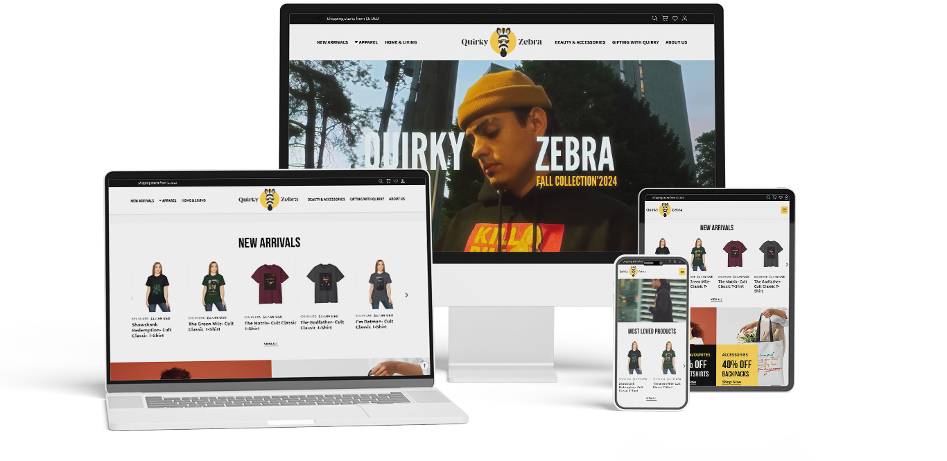
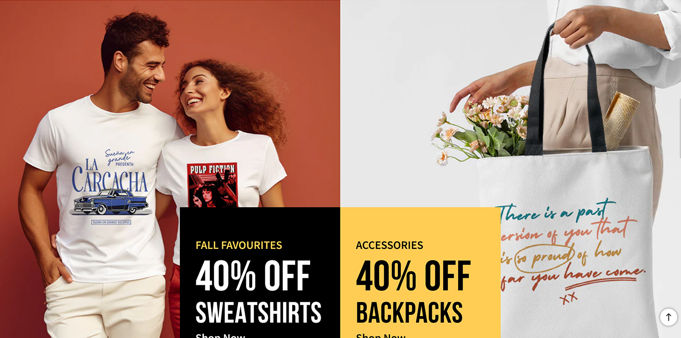
Quirky Zebra started as a new name in the fast fashion world with quirky, wacky, and superbly fun attire with spur-of-the-moment pop-culture references on apparel and household items. This included using popularly used phrases, lingo, jargon, movie dialogues, and more by pairing them with retro and contemporary art designs from all over.
PROBLEM STATEMENT
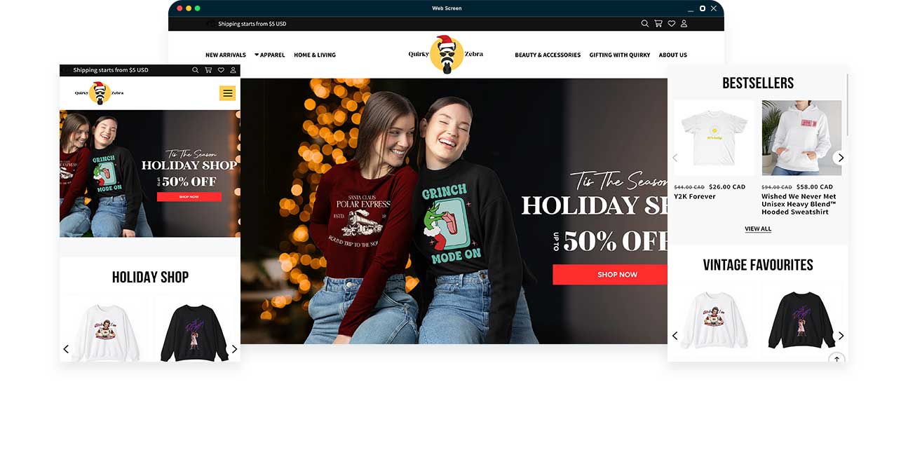
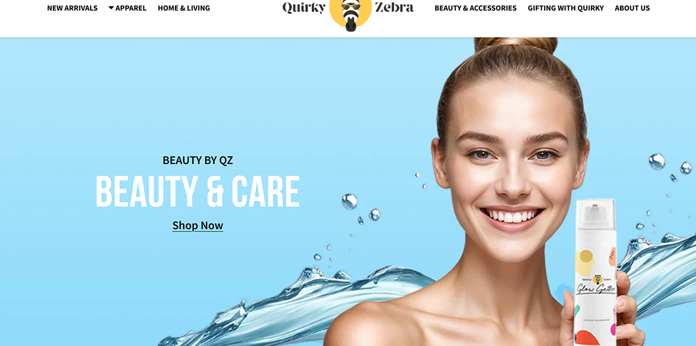
Design mock-ups of the homepage were designed for the homepage. Various versions containing different styles and elements of design for the layout, navigation, and sectional parts were designed to demonstrate different looks on how the homepage could be portrayed. Each design ensured the page would be optimized and clearly convey the brand’s message and message.
RESEARCH & DISCOVERY
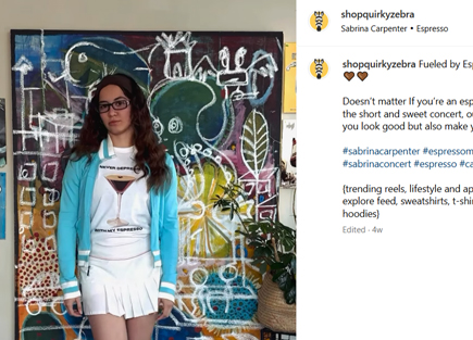
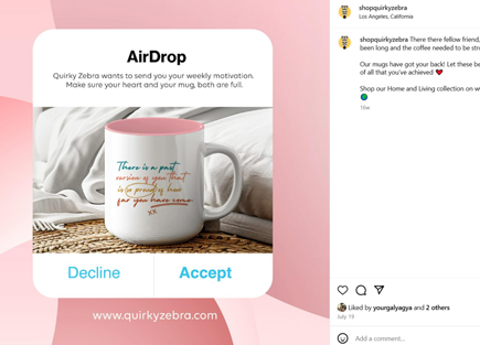
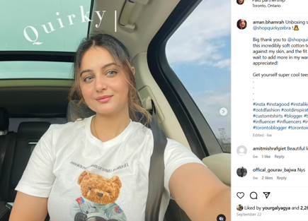
As a new startup, Quirky Zebra was given a full 360-degree digital experience from website design and development to a full social media experience complete with banners, posts, and page designs for a solid digital presence online and on social media platforms of effective lead generation and sales.
GOALS
Developing a revamped version of the KAP aimed both at modernizing the look and feel of the portal, as well as creating new engagement and contribution opportunities for its users and for GCM Participant organizations. The process hence also included redesigning and improving user log-on and profile features, options to join and manage private and public communities of practice, creating individual content collections, and submitting knowledge resources, news and country stories directly to the platform.
Together with the client, we used basic low-fi wire-framing and several iterations of draft designs to determine the new page look and key user functionality.
site map
We assessed the portal’s information architecture jointly with the client, and agreed on a streamlined content ‘hierarchy and navigation elements.
visual design
The portal’s original design was dark and dated. There was no effective way to structure content and the overall visual language and UI design on the platform was largely inconsistent. The page also presented multiple responsiveness issues, and did not display correctly on mobile devices.
We developed a new design:
- Offering a lighter, more contemporary look and feel.
- Introducing a distinctive content hierarchy.
- Transforming the side menu into an easy-to-navigate, horizontal mega menu.
- Deploying a full responsive page design with up-to-date technical standards.
- Incorporating a memorable layout for material and resources, including colour-coding and hero images for better user recollection.
- Redesigning user registration, log-on and content contribution features.
logo explorations


colour palette
- #fecd53
- #343230
- #b5b5b5
- #f8f8f8
SECURITY
Since the platform offers user registration and hosts multiple resources from the client and partners, we ensured highest privacy and data security standards. This includes manual user verification by admins, as well as automated steps with integrated captcha and two-factor authentication.
DEVELOPMENT
Our development team worked to build this platform using HTML 5, Drupal, CSS3 and JAVASCRIPT. We worked with the pre-established data base built primarily in Drupal. Based on the information gathered during the discovery phase, our team created a custom website design that aligned with the customer’s needs. We used industry standard practices, ensuring responsive, cross-browser compatibility and optimal performance. Security
Since the platform offers user registration and hosts multiple resources from the client and partners, we ensured highest privacy and data security standards. This includes manual user verification by admins, as well as automated steps with integrated captcha and two-factor authentication.
